
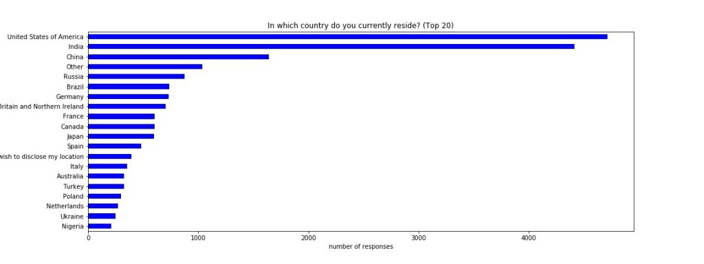
Who are the survey respondents?
The survey replies were primarily from the US and from India with China as a distant third:
Almost all users provided their gender as either male or female.
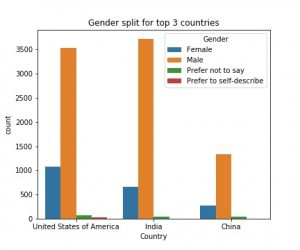
Most respondents from those top 3 countries were male. About 23% of the respondents from the US were female, while the share of female respondents from India and China were 15% and 16%, respectively.
Digging further into the age split by country for male and female respondents shows: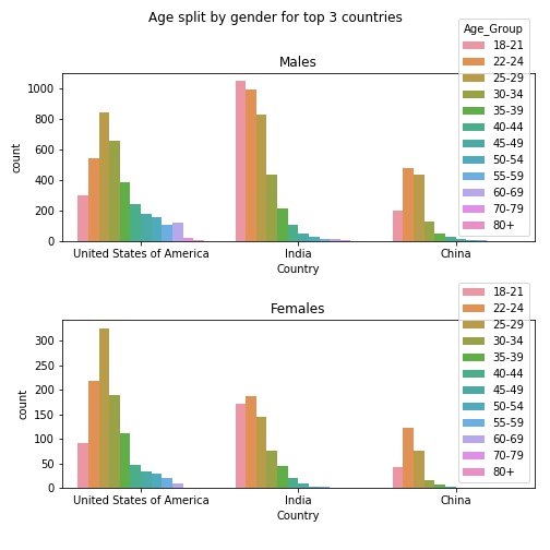
- for the US the 25–29 age range was the most common for men and women — the average age was 33 years.
- respondents 50 years and older were mostly US men — this age range was underrepresented among US women.
- the Chinese respondents' average age was 26.4 years, slightly below the Indian average age of 26.6 years.
- the distribution of ages among Indian male respondents shows that the youngest age group (18–21 years) was more common than any other age group, while for Indian women the 22–24 age range was more prevalent.
What are the income levels by country and gender?
Survey participants reported their income by indicating a range in USD.
Some respondents reported salaries above 200k USD but especially for India and China, the annual salaries were mostly below 50,000 USD. The average income for the US was 100k USD and for India and China about 22k USD per year (since salaries were reported in brackets, midpoints were assumed for each respondents’ bracket). If the very high salaries were to be removed from the sample then the averages for China and India would be even lower than for the US.
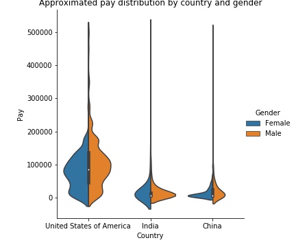
Splitting the data by gender in each country shows that:
- the Chinese women’s pay has a narrower distribution than Chinese men’s and the average seems to be lower.
- the income distribution for male respondents from India has a narrower range than that of their female counterparts.
- the distribution for US male survey takers pay shows a higher center point at around 100k USD with a wide range beyond 200k USD while the pay distribution for US women tapers off sharply above 100k USD.
The distribution of salaries by country and gender appears to show that men earn more than women. This gender pay gap is consistent with research found elsewhere.
Do female data scientists get paid less than men?
So far we have looked at all replies to the survey. Survey respondents reported a wide range of job titles, educational attainment, years of job experience, and tools used. We need to dissect the data more carefully so that we don’t compare a male CEO in his 50s from India with a female Indian math student and then conclude that he makes more than her (which he probably does).
The Kaggle survey had a question that will help us zero in on the data scientists. Kaggle asked each participant “Do you consider yourself to be a data scientist?”.
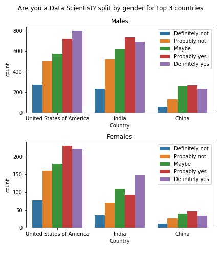
There is a dip in the “probably yes” group for Indian women but other than that we get several hundred individuals that rate themselves on the “yes” side for the US and India. The number of Chinese women in each group is considerably smaller so we will focus on the US and India going forward.
Now we have all the ingredients to try to answer the question if there is a pay gap between men and women — we will look at individuals that ranked themselves as data scientists and compare their pay, age, gender, and country. That’s a lot of dimensions to pack into one visualization:
- below you see four charts (left column is US, right column is India, the top row are individuals that ranked themselves as “probably” or “definitely” being a data scientist, the bottom shows only individuals that are “definitely” data scientists).
- each chart shows the age vs. income distribution as contour plots — the “peaks” are where most of the values are.
- to show male and female responses on top of each other for easy comparison, the distributions for women are drawn in blue contour lines, while the replies from men are the filled orange contours.
- to compare men and women, just compare the orange and blue“peaks” in each plot and notice how the distributions differ.
Please note that the smooth lines give the impression of extremely detailed and rich data but we are getting into some pretty sparse areas of the dataset already (eg there were only three Indian women in the age group 45–50 that considered themselves “definitely” data scientists). Nevertheless, the overall shape of the contour plots should give us some insight into the data:
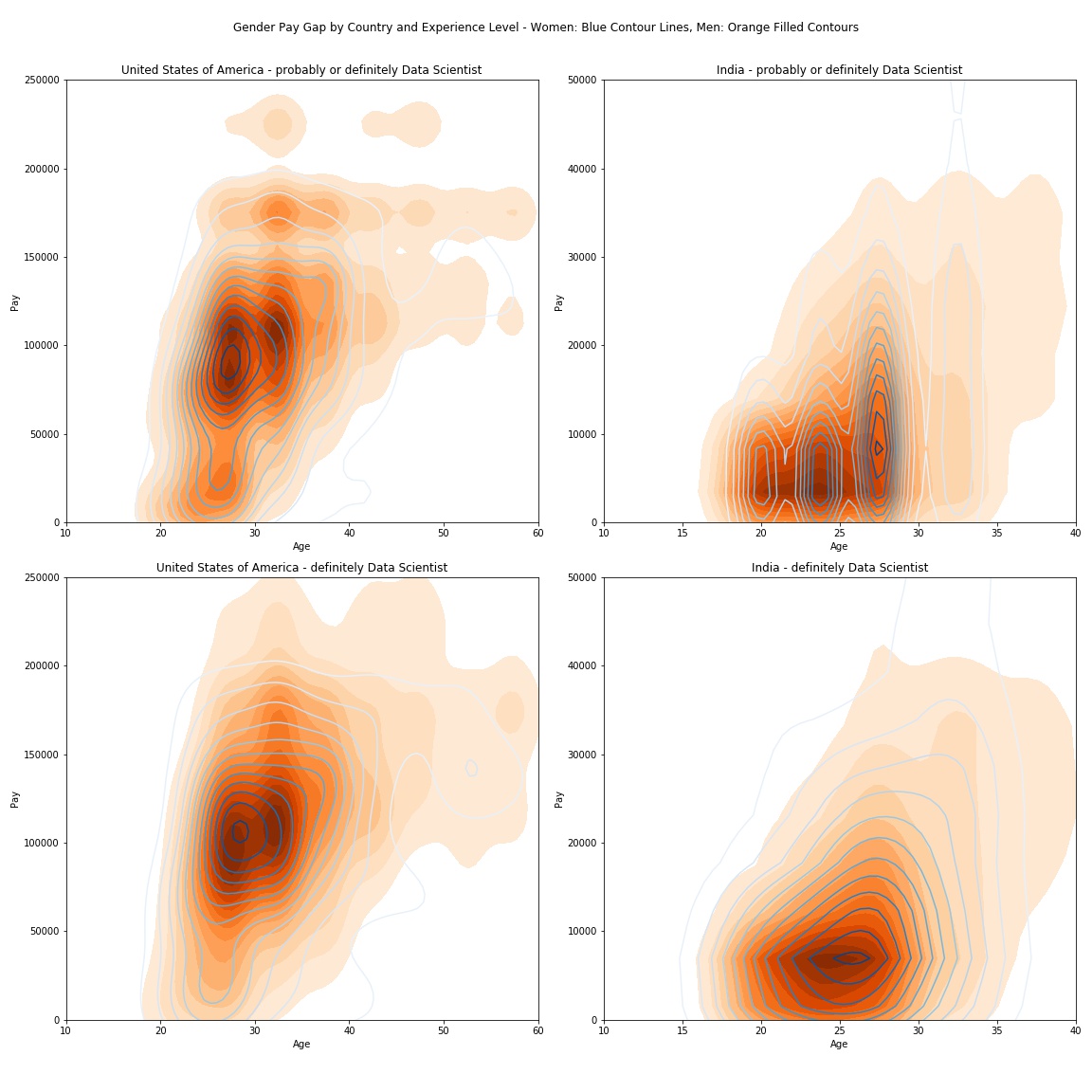
It is very hard to estimate how confident respondents were when they categorized themselves as “probably” or “definitely” data scientists. There might also be differences between genders and culturally between countries. For this analysis we will focus on those who had the confidence to consider themselves “definitely” data scientists — so let’s try to understand what we might infer from the charts in the bottom row:
The female data scientists that responded to the Kaggle survey that are in their late 20s from the US appear to earn a bit more than their male counterparts (the blue peak is above the left orange peak). But for older males the pay seems to be higher than for females (the 30–35 age group has a much higher salary range expanding more into the 150k+ USD area).
The pay gap between male and female self-categorized data scientists from India appears to be minimal (the overall shape of the distributions is fairly similar). Most male Indian data scientist seem to be a few years younger than females in the same pay range (the peak for men and women is 2–3 years apart).
great post, thank you for posting the content.
data science
useful information.